Swisscard cashback campaign-landing page with revamped credit card application-process
The overall goal for the campaign-driven landingpage was to get people to sign up for the newly launched cashback cards. To achieve this, we analyzed and fundamentally reworked the existing credit card application process. The recognizability of the campaign was achieved through the adaptation of the strong imagery, the vigorous colors and the distinctive slants.


Rework of the card application process
The seamlessly integrated credit card application process is the centerpiece of the landing page. It is accessible from anywhere within one click through the sticky cards teaser. The process was completely restructured to improve the user experience and thus reduce drop-off rates. It was divided into 5 meaningful steps that remain visible to the user at all times.
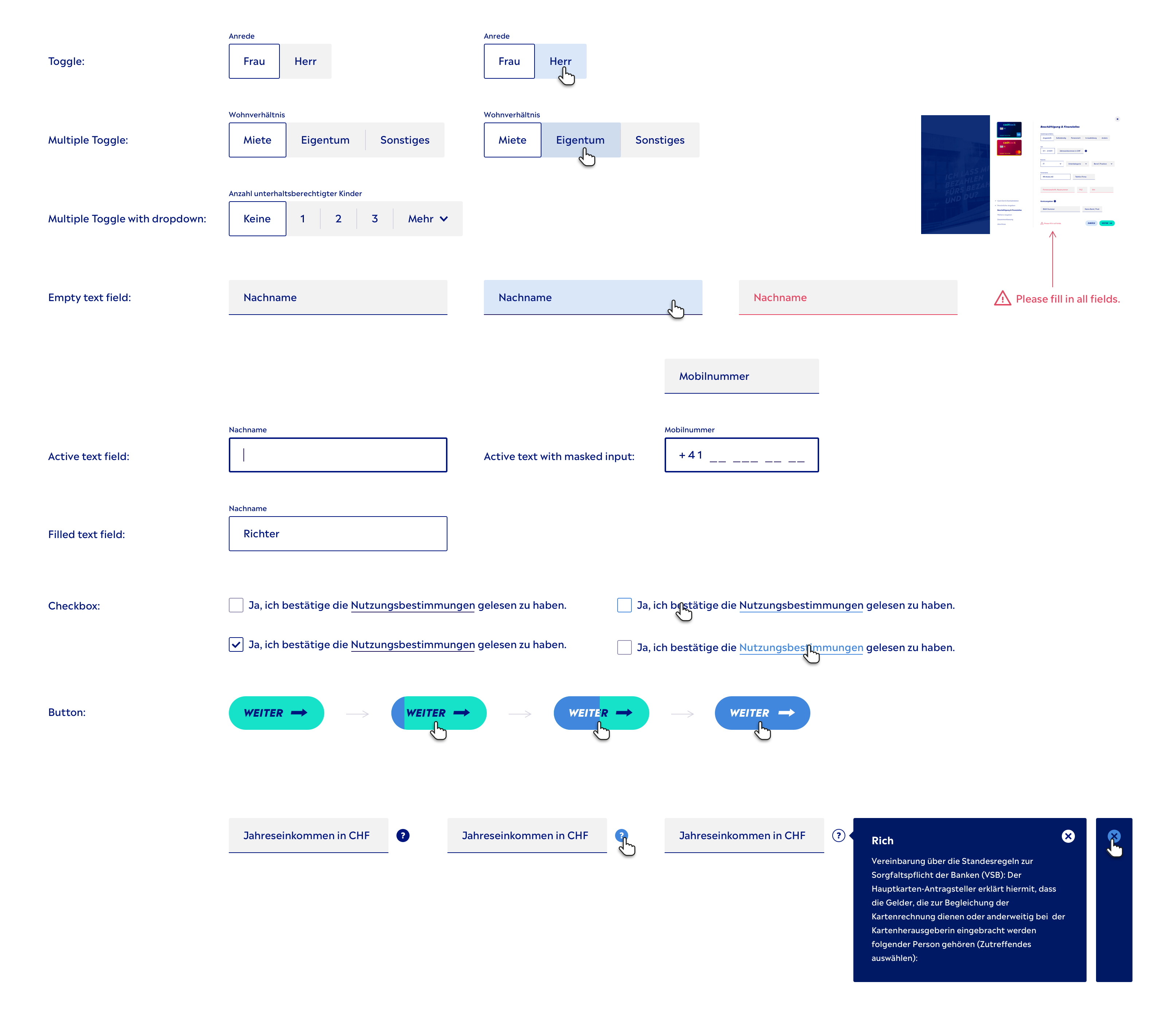
The form elements were optimized touch-first, using e.g. segmented controls instead of drop-downs. We further use masked inputs whenever possible.
All data is stored, so the user can come back anytime and resume where they left off.


Design pattern
The design pattern builds on a homogeneous form field look. The colors range from white (active) to pastel blue (hover state) and grey (inactive state). The scheme provides a good overview for the users, without distracting too much. CTAs are clearly lifted off in bright turquoise and blue.
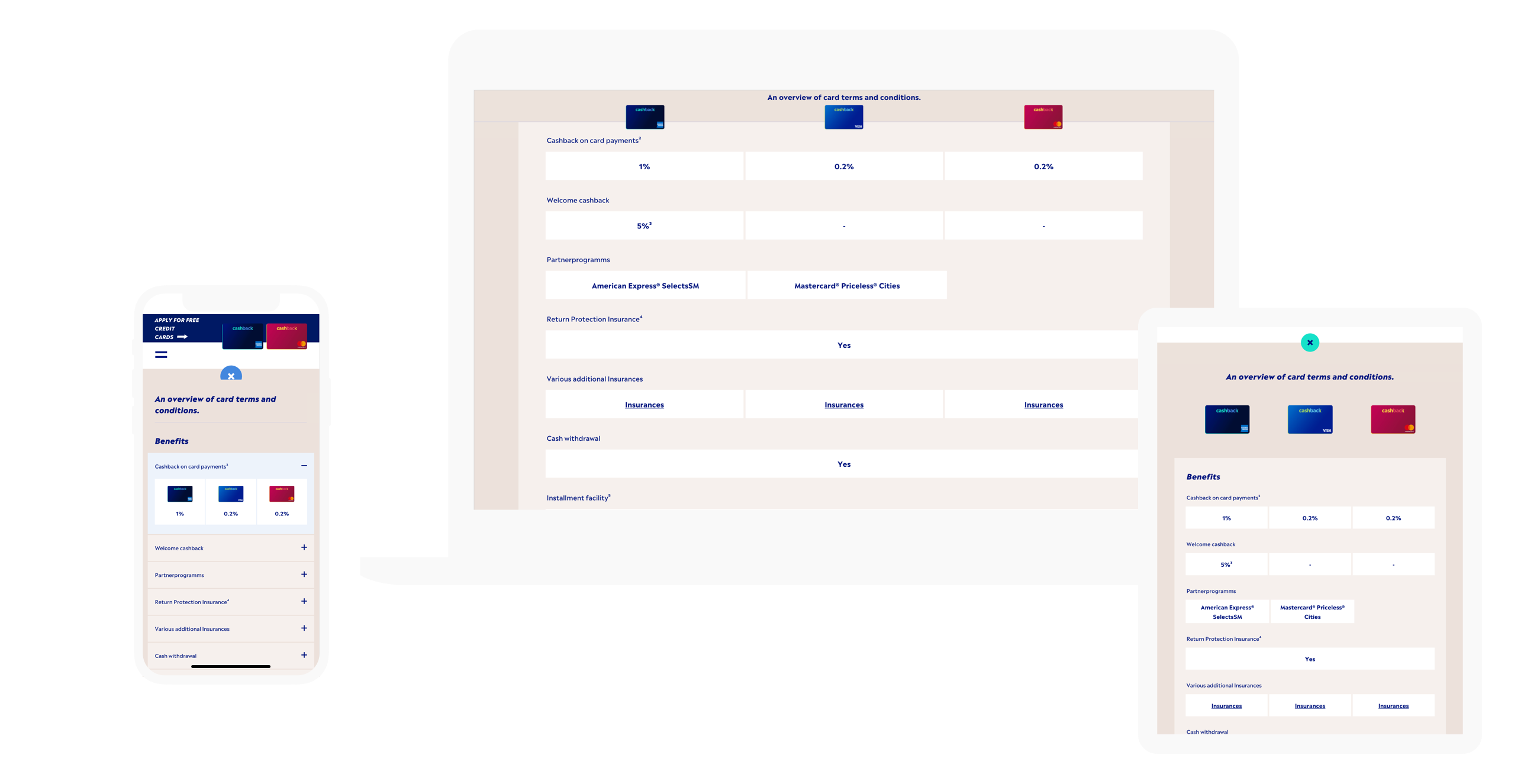
An overview of cards with their terms and conditions
All the relevant card information needed to choose between the two cards is listed in a clear interactive table, which adjusts to every breakpoint and device.
2019
Campaign Site
Concept, UX Design, Art Direction, Frontend & Backend
/w Sir Mary
